6 Main Components
Banner, Hero, Features, Testimonials, Help Section, and Call to Action
What you'll find in this guide
The home page is the first impression visitors get of Founders Club. This guide walks you through each component section, explaining what they do, what fields to fill out, and best practices for content creation.
6 Main Components
Banner, Hero, Features, Testimonials, Help Section, and Call to Action
User-Friendly Fields
Each component has intuitive fields designed for non-technical users
Instant Preview
See changes in Sanity Studio before publishing to the live site
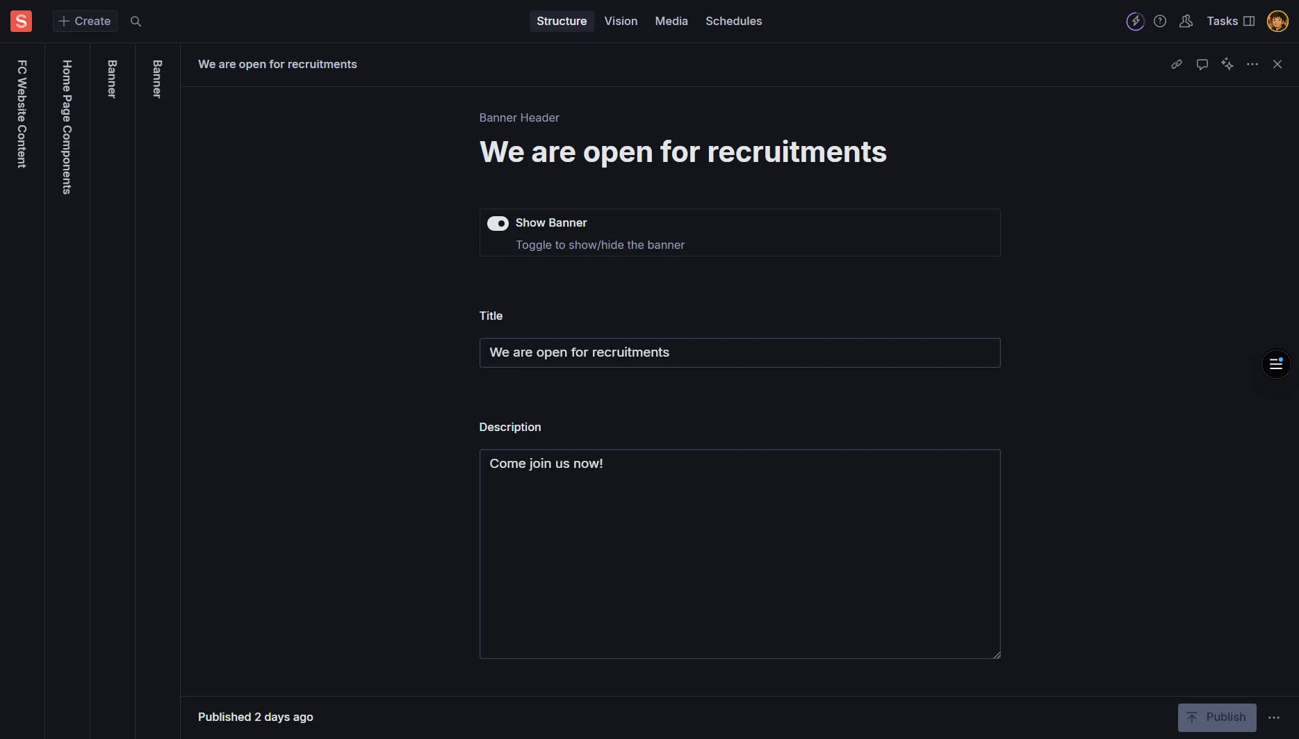
The Banner is a prominent strip at the top of the page that highlights key information or timely messages. Perfect for announcements, promotions, or important updates.
Title
Required - A short headline (aim for under 60 characters)
Example: “Welcome to Founders Club 2025!”
Subtitle/Tagline
Optional - A supporting line below the title
Example: “Join India’s premier startup community”
Description
Optional - One or two brief sentences for context
Example: “Connect with like-minded entrepreneurs and grow your startup”
Visibility Toggle
Boolean - Turn banner on/off without deleting content
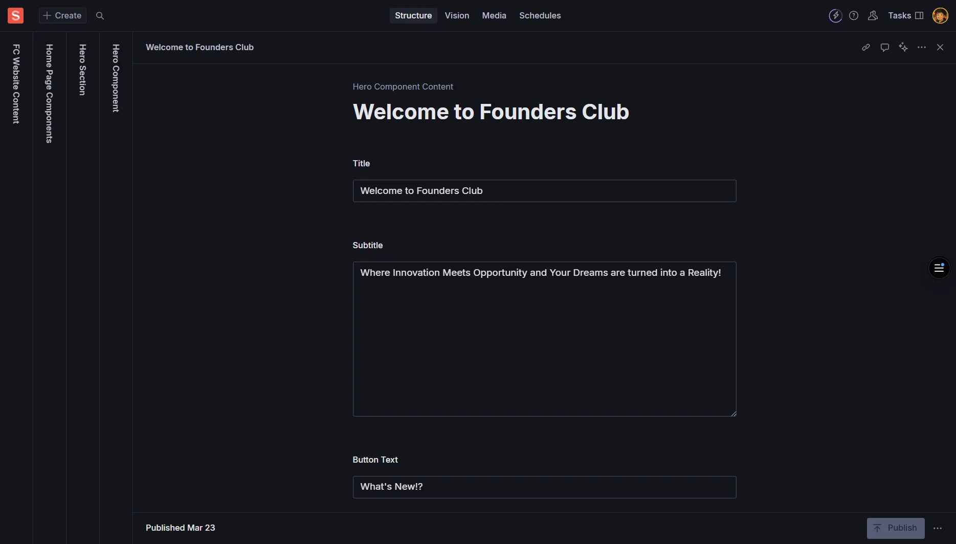
The Hero is the main focal point near the top of the page. It’s typically larger and more visual than the banner, designed to make a strong first impression with compelling messaging and imagery.
Heading
Required - The main statement; keep concise and impactful
Example: “Build Your Startup Dreams Into Reality”
Subheading
Optional - Supporting line under the heading
Example: “Connect, Learn, and Grow with India’s Top Entrepreneurs”
Body/Description
Optional - 1-3 short sentences providing context
Rich text formatting available
Media
Optional - Large image (1600px+ width for images)
Always include Alt Text for accessibility
Layout Options
textLeft - Text on left, media on right
textRight - Text on right, media on left
centered - Text and media centered
Call to Actions
Array - Add up to 2 CTA buttons
Primary and secondary actions (see CTA section)
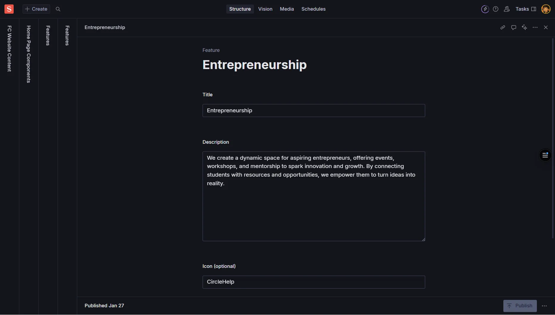
The Features section showcases the benefits, capabilities, or key highlights of Founders Club. It presents information in an organized grid or list format.
Section Title
Required - Main heading for the features section
Example: “Why Choose Founders Club”
Introduction
Optional - Brief introductory text
Example: “Discover what makes our community special”
Layout Style
Options: 2-col, 3-col, 4-col, list
3-col is recommended for readability
Theme
Options: default, tinted, contrast
Visual variations for different styles
Each feature item in the array includes:
Item Title
Required - Short title (aim for 3-5 words)
Example: “Mentorship Programs”
Item Description
Required - 1-2 sentences (15-30 words ideal)
Example: “Get guidance from successful entrepreneurs who’ve built companies from the ground up.”
Icon/Image
Optional - Small visual representation
Use consistent icon style; add Alt Text
Link/CTA
Optional - If the feature links to a detailed page
Highlight/Emphasis
Boolean - Visually emphasize this particular card
Use sparingly for most important features
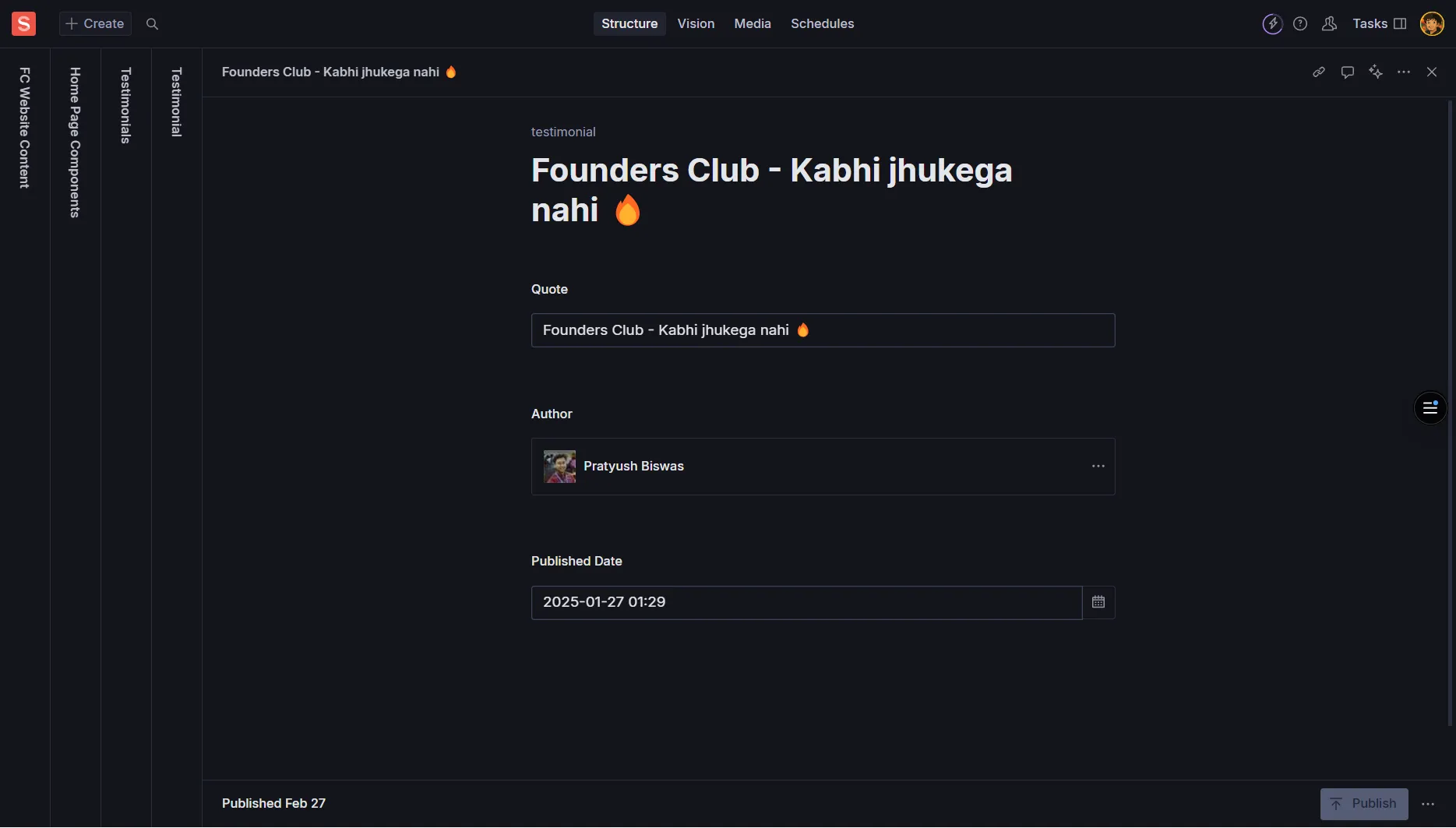
Testimonials provide social proof from members, partners, or successful entrepreneurs who have benefited from Founders Club. They build trust and credibility.
Quote
Required - The testimonial text itself
Keep natural and authentic; avoid overly long paragraphs
Author Name
Required - Full name of the person
Example: “Priya Sharma”
Role/Title
Optional - Their position or role
Example: “Founder & CEO”
Company/Organization
Optional - Where they work or what they’ve built
Example: “TechStart Solutions”
Avatar
Optional - Headshot of the person
Add descriptive Alt Text like “Portrait of Priya Sharma”
Company Logo
Optional - If highlighting their brand
Add Alt Text describing the logo
Rating
Optional - Star rating (1-5)
Use if your design supports visual star ratings
Source Link
Optional - Link to case study or original source
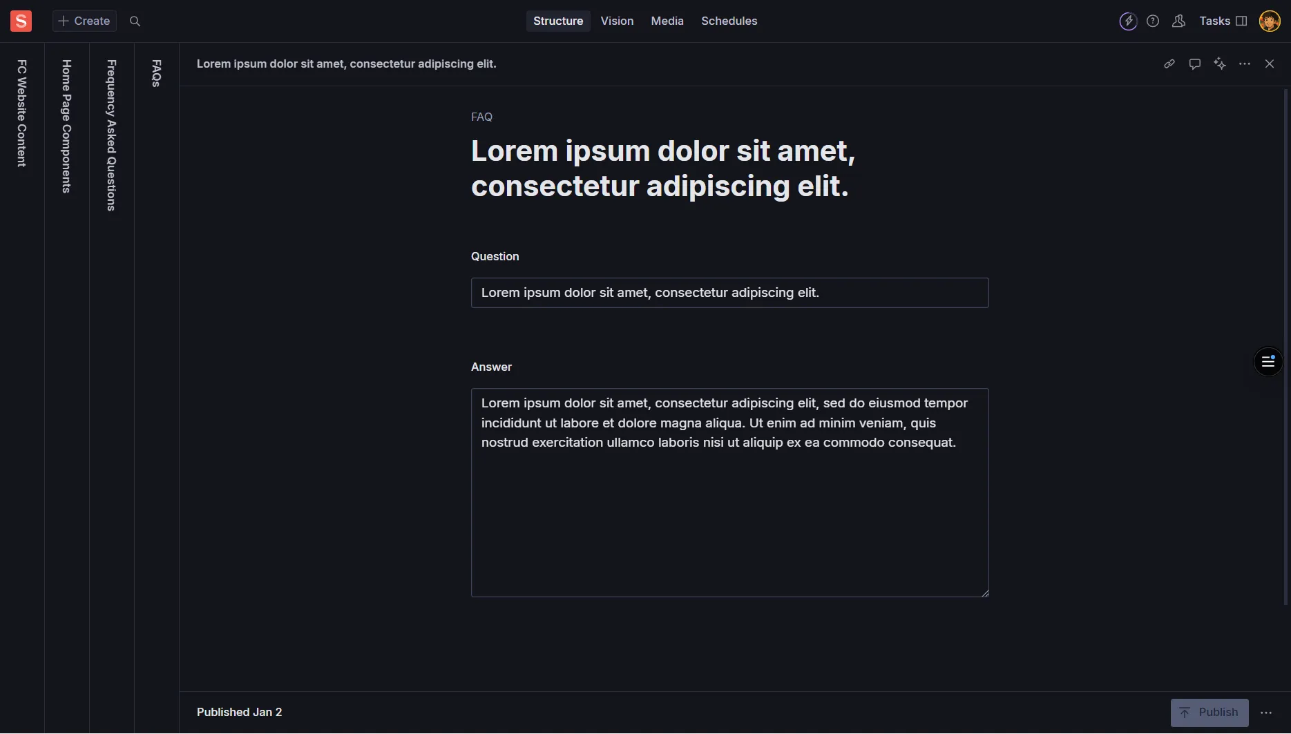
The Help section provides support and assistance to visitors. It typically includes FAQs, contact information, and helpful links to guide users to the resources they need.
Section Title
Required - Main heading
Example: “Need Help?” or “Frequently Asked Questions”
Introduction
Optional - Brief description of available support
Example: “Find answers to common questions or get in touch with our team”
Question
Required - The question users commonly ask
Example: “How do I join Founders Club?”
Answer
Required - Clear, helpful response
Use rich text formatting; keep paragraphs short
Category/Tag
Optional - Organize by topic
Example: “Membership”, “Events”, “Billing”
Link Label
Required - Descriptive text for the link
Example: “Contact Support”, “Member Portal”, “Documentation”
URL
Required - Link destination
Internal: select page reference; External: full URL (https://…)
Open in New Tab
Optional - Boolean option
Use true for external URLs
Contact Details
Optional - Email, phone, business hours
Ensure all contact info is current and monitored
Main CTA
Optional - Primary action button
Example: “Get Support” or “Contact Us”
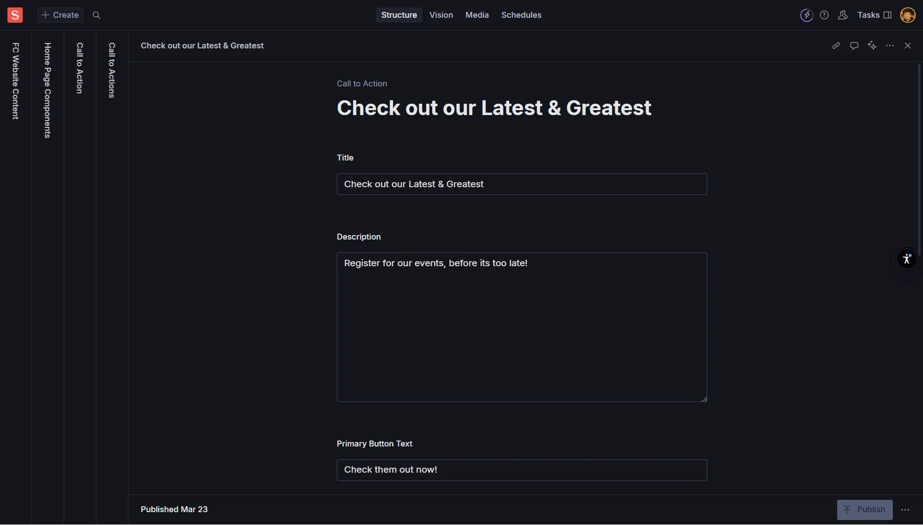
A CTA is a button or link that prompts users to take a specific action. CTAs appear throughout various components and are crucial for guiding user behavior.
Label
Required - The button text
Example: “Get Started”, “Join Now”, “Learn More”, “Contact Us”
Keep short and action-oriented
Link Type
Required - Internal or External
Internal: Page within your site
External: Full URL to another website
URL/Link
Required - The destination
Internal: Choose page reference or enter slug
External: Full URL starting with https://
Style/Variant
Required - Visual emphasis level
Primary: Main action (standout button)
Secondary: Alternative action
Outline: Subtle emphasis
Ghost: Minimal styling
Open in New Tab
Optional - Boolean option
Typically true for external links
Icon
Optional - Small icon next to label
Use sparingly and consistently
Action-Oriented Language
Use verbs that tell users exactly what will happen
Good: “Join Now”, “Download Guide”, “Start Free Trial”
Avoid: “Click Here”, “Submit”, “Button”
Hierarchy
Primary: Most important action (1 per section)
Secondary: Alternative or supporting actions
Don’t use more than 2 CTAs in one component
Link Management
Internal Links: Use page references when possible (less error-prone)
External Links: Always include https:// and verify links work
Alt Text for Images
Always provide descriptive Alt Text that explains what the image shows
Example: “Group photo of Founders Club members at networking event”
Avoid: “image”, “photo”, or leaving blank
Color Contrast
Ensure text is readable against background colors or images
Test with high contrast mode enabled
Use tools to verify contrast ratios meet accessibility standards
Link Descriptions
Make link text descriptive and meaningful
Good: “Read our membership guide”
Avoid: “Click here” or “Read more”
Consistency
Tone: Maintain consistent voice across all sections
Capitalization: Follow title case or sentence case consistently
Punctuation: Be consistent with periods, exclamation marks
Brevity and Clarity
Headlines: Keep under 60 characters when possible
Descriptions: Use 1-3 short sentences
Button Text: 1-3 words maximum
Brand Voice
Follow Founders Club’s established style guide
Professional yet approachable tone
Focus on community, growth, and entrepreneurship
Image Optimization
Minimum Width: 1600px for hero/banner images File Format: Use WebP when possible, JPG/PNG as fallback File Size: Optimize for web (under 500KB ideally)
Link Management
Internal Links: Use page references to avoid broken links External Links: Include https:// and verify they work Testing: Check all links after publishing
Content Preview
Always preview changes in Sanity Studio before publishing
Check how content looks on different screen sizes
Verify all fields are filled correctly
What's the recommended maximum character count for banner titles?
Which hero layout option places text on the left side?
What's the ideal word count for feature item descriptions?
Which CTA style should be used for the main action in a section?
What should you always include when adding images?
What did you learn?